Hello, crafty friends! I finally got the chance to make some cards – snow day – and I wanted to get these online as soon as I could. This collection is from Scrapping for Less1 – January card kit. I love coffee…but not this much! LOL I had fun with this collection though.

I started with the cardstock that comes included in the kit. All of their cardstock is from My Favorite Things2 and they add 2 sheets of Neenah 110# Classic Crest Smooth Solar White3. I cut them all to 4.25 x 5.50, even the white.
I like to use the Card Sketch sheet4to plan out my cards. Usually, I make one of each style for each collection, so that gives me a total of 16. Somehow, I lost one in the process…still looking for that 16th one!

Anyway, I take each collection and start planning out what I am going to make. This time, for some reason, everything got mixed up in the planning stage so I don’t know what collection is what and what special ingredients went to each collection, so it’s kind of a hodge-podge but it worked out okay. I cut all the pieces for each card out first, then the sentiment panel in the white, and matched the colors of the paper to the cardstock.
After this process, I decide what picture and/or sentiment I will use for each card. Since I had pre-cut all of these out of the white cardstock, I just stamped them using my Mini Misti5 and the
Chestnut Roan chalk ink that came in the kit.

This is what my workspace tends to look like while this work is in progress (actually this is unusually cleaner than normal since I created a workspace behind me at my crafting table)… I am a messy planner…well, messy everything when I’m creating! Anywho, this is where I lost track of what papers went with what collection…oh, well. I also somehow ended up with three cards per pattern, and three haphazard cards that kind of got lost in the process!

You get to see my beautiful flannel sheets! LOL but it’s a large area and I just spread all the cards and paper out to figure out what stamp went with what collection. I had my Prismacolor6pencils off camera, and I started coloring in the pictures according to the pattern papers. Since I have a chart for all my pencils, I just used that to decide the closest color to match. Then I sat in bed and started coloring.
Gavin, my nephew who lives with me, likes to come in my room in the evenings when I’m sitting in bed…he says it’s to spend time with me, but I know it’s really my cat, Parker, he comes to see. Both my dog, Checkers, and Parker love Gavin, so they enjoy his company as well. He has a good eye for colors and helped me match up the pencil colors to the patterned papers.

Each card had either a colored main focus, or a cut-apart, so some had sentiment strips, and some used the sentiments in the cut-aparts. All the work is done on the design panel – the colored cardstock – and built from there.
Each design panel is cut down to 4 x 5.25, so there is a little white border around the edges. All my bases are standard A4, – 4.25 x 5.40. I usually use my preferred bases made from Ultra Heavyweight Cardstock, Double-thick 110 lb Cover, Digital Smooth, 8.5″x11″ White 98- Bright7. I get this from Amazon and it’s perfect for card bases – very sturdy. All my cards are usually double layered – one piece is given dimension with either craft foam or foam tape.

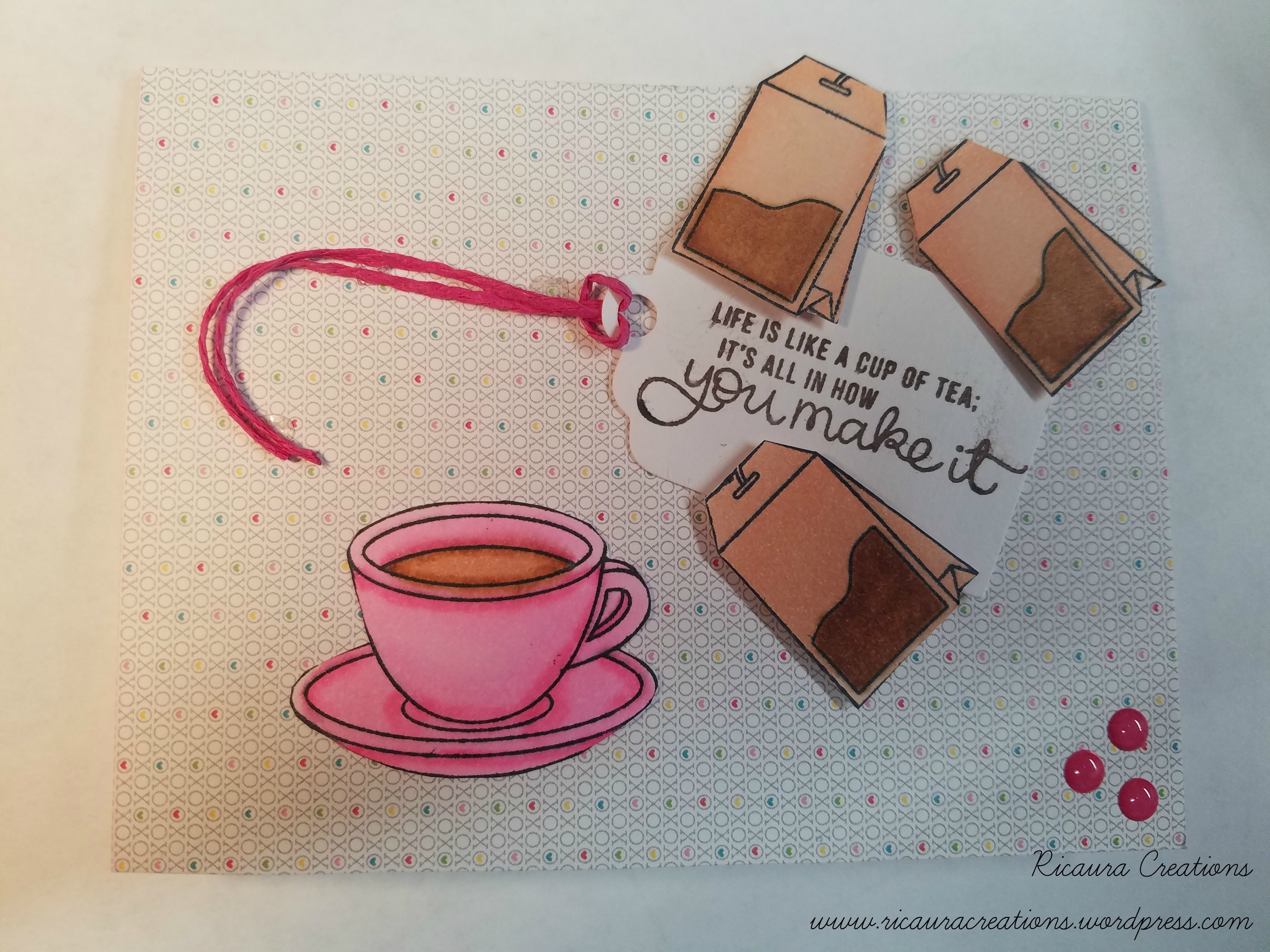
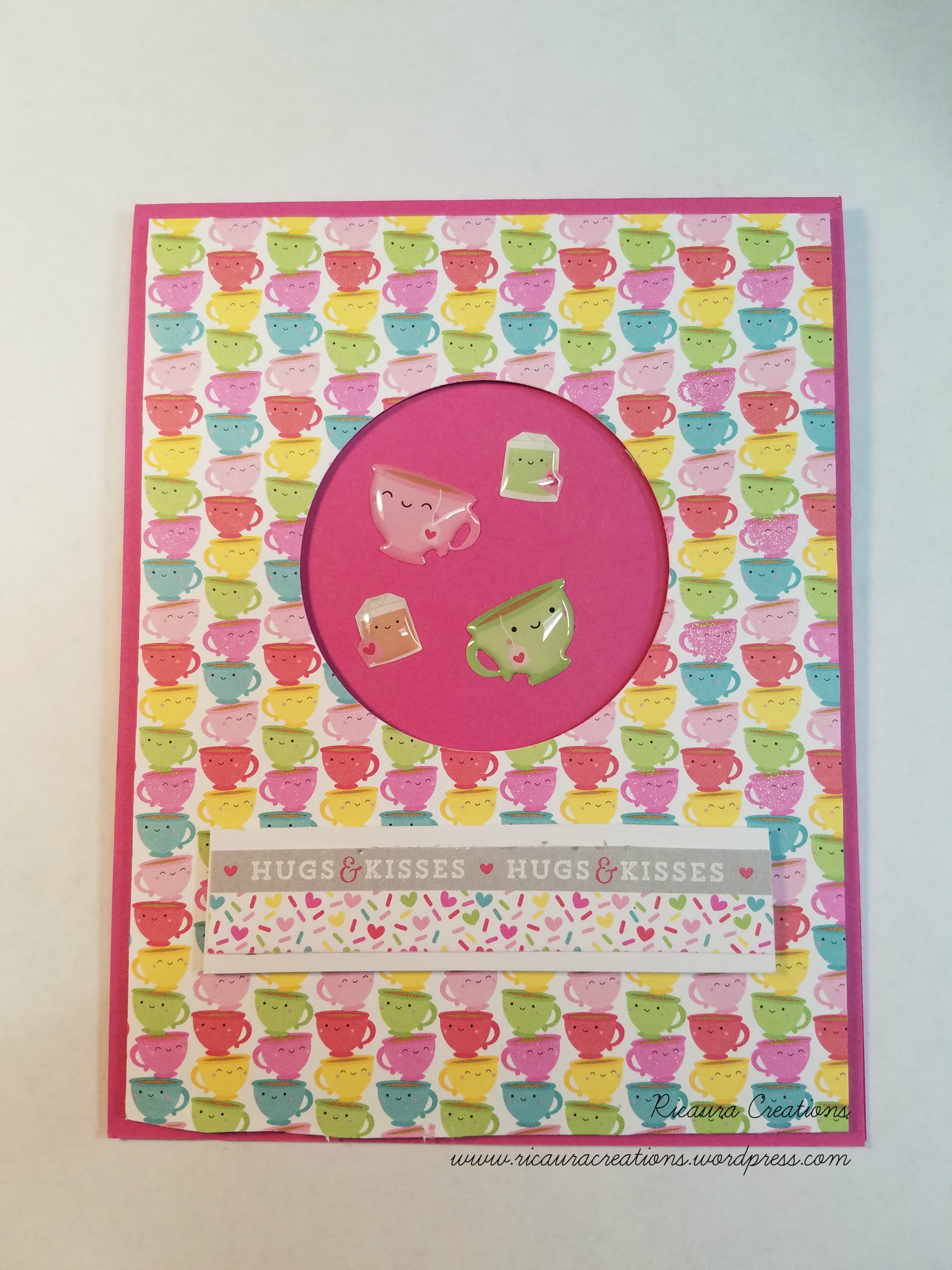
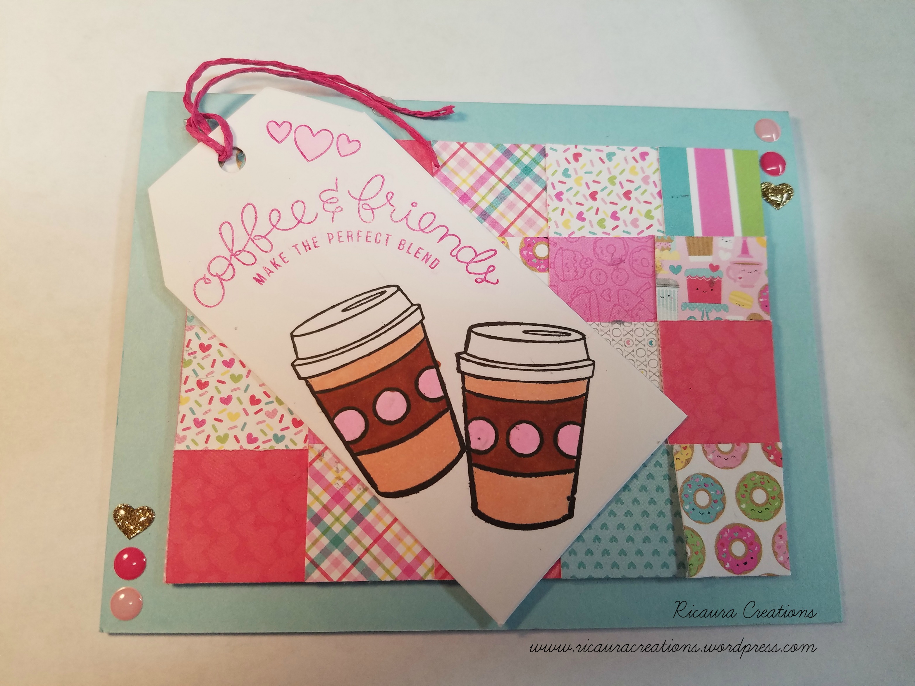
The first card was very simple. I used Sketch #2 and the insert paper was given dimension with foam tape. The oval ephemera from one collection fit in the oval cardstock, so I used that. It was built on the Sno-Cone cardstock. I love these colors and patterns! I added another piece of ephemera to give it a little more design, and sequins from the collection – actually, I dumped all four packages of sequins in a dish and just used what I wanted for each card. I figured since I messed up the paper stock collections, going this route wasn’t going to hurt! This next card is very bright and colorful. Using the Lemon Drop cardstock – and again pattern design #2, I matched the bright coffee cups paper with the bright zig-zag paper. I also used one of the cut-aparts that came in the kit. I had to laugh at this sentiment…my coffee cup is about 20 oz or more! So this fit! LOL The centerpiece is given dimension with foam tape, and a little is added to the cut-apart at the top so that it doesn’t get bent out of whack when it’s mailed. A few sequins finished this off. My third card reminds me of my youngest daughter…she likes her coffee, too! I love the color combinations in this card…rose, espresso brown, and cream. This is still the 2nd pattern, and I used another cut-apart. Foam tape gave the rose dotted paper dimension and I also added a puffy sticker of a coffee cup. A few sequins and this card was done.

The next three cards use Sketch #1, with a few alterations. I love the stamp with the melting snowman so two of these cards use that stamp, but the other is my favorite! I love Newton’s kitten and the donut! He is so adorable! The first card uses the Lemon Drop cardstock for the design panel, then the gorgeous plaid paper, the dark green paper, and a silver ribbon and bow. I colored the snowman in using #944 Process Red, #905 Aquamarine, #1082 Chocolate, and #916 Canary Yellow Prismacolor Pencils. No fancy coloring methods – I’m still learning….Of course, this one had to have “the” perfect sentiment – “I melt for good coffee and great friends”! The second in this set uses the same design idea, on the kraft design panel, and the brown polka-dot paper, and the coffee bean paper. This is a cutie! I used #1082 Chocolate, #1099 Espresso, and #918 Orange for this little guy. The third card in this trio used the pattern paper with all the desserts, the teal polka-dot paper, and of course, Newton’s Kitten. Life is definitely better with Sprinkles! I colored the kitten and donut by matching them to the dessert paper – #916 Canary Yellow, #944 Process Red, #918 Orange on the sprinkles, #941 Light Umber for the donut, and #1099 Espresso and #1069 French Grey 50% on the kitten. A little #929 Pink for the bottoms of his feet, inside his ears and his nose. A few sequins and this card is done.

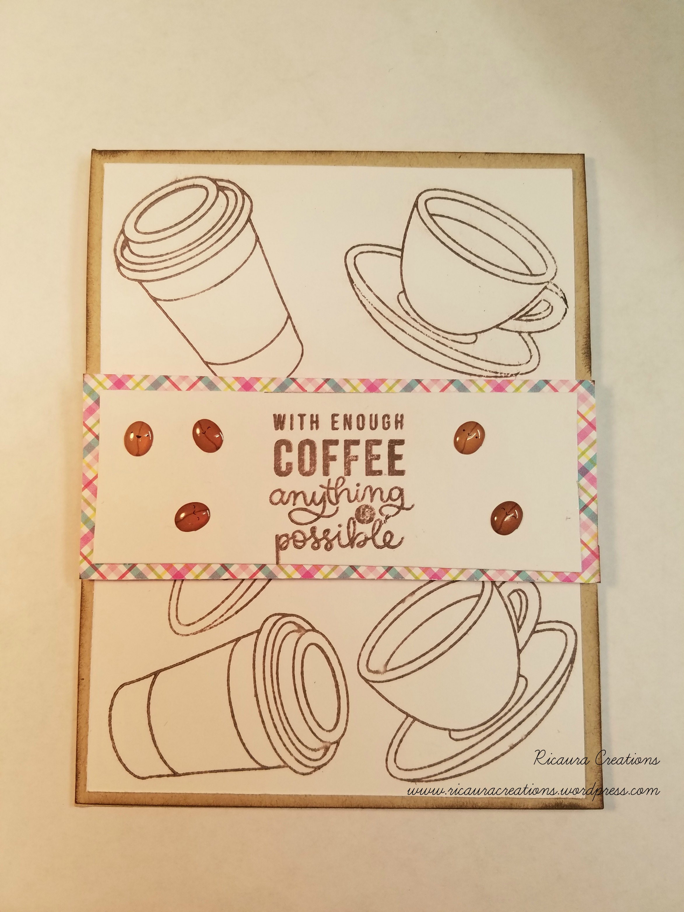
The next trio used Sketch #4 for its designing. Using the Whip Cream cardstock for my 1st design panel, I layered the patterned paper per the design. I created a banner out of patterned paper, and a large circle – cut in half – for the designs. The first card also had a chocolate brown ribbon added to give it more “Je ne sais quoi” (yes, I had to look it up to spell it right! LOL). The main focus is the coffee cup, colored to match the circle patterned paper. I also bent the one sentiment to curve at the top of the circle for this one. I colored the coffee cup pretty simply – no fancy color layering – #1002 Yellowed Orange, #944 Process Red, #1082 Chocolate, and #905 Aquamarine. I chose the Coffee Break Marci stamp for the second card, coloring her to match the patterned paper again. I tried a little color layering to create her hair…didn’t turn out great, but it works. I used #941 Light Umber and #997 Beige for her hair…then #933 Hot Pink and #905 Aquamarine for her outfit. I think I used #927 Peach Light and #1018 Pink Rose for her skin. I used foam tape behind the plain paper, glued down the cup paper, and half glued half foam tape for the paper under Marcy. I backed her using one of the teal polka-dot papers. I also added a little square cut piece of this paper behind the sentiment. A few sequins and I’m done. The third card uses the Sno cone cardstock, a strip of the chocolate and beige polka dot paper, and the large antique..y blue polka dot paper, and then a square tipped on its side. I added a piece of the ephemera for the sentiment and a puffy stick for decoration. A few sequins and this trio is done.

The fourth trio got one wonky designed card…for some reason, I created one in landscape rather than portrait, but it turned out cute. The first card – the landscape one – used the Kraft cardstock, the chocolate plaid paper, and the paper with the foam designs in coffee cups to create. I added a small circle with the dark coffee beans, the brown ribbon that came in the kit, and another square turned on its side for the focal point. The banner portion is given dimension with some foam tape, and some are used behind the square to level it with the tag’s height. I added the woodchip coffee cup to the center, a tiny strip of sentiment, and a few sequins. The second card is in the right direction…lol…I used the coffee bean patterned paper on the Sno Cone cardstock and the golden paper with the beans and dots on it for the banner. A circle of the red squiggly paper was tucked underneath. Again, I stamped the Coffee Break Marci stamp using the Chestnut Roan chalk ink in an oval and colored her in using #905 Aquamarine, #917 Sunburst Yellow, and # 1029 Mahogany Red for her outfit. Her hair is #1099 Espresso and #1070 French Grey 30%. A few sequins and this card is done. The third card used the Whip Cream cardstock for the design panel, golden swirl paper, chocolate brown polka dot paper, and the teal polka dot paper for the design cuts. I stamped the Brew It Anya stamp with VersaFine Onyx Black ink8and colored her in using #997 Beige and #1082 Chocolate for her hair, and #1099 Espresso, #997 Beige, and #918 Orange for her outfit. I fussy cut her out…I really hate fussy cutting!… and glued her to the teal polka-dot paper. The chocolate polka-dot paper was given dimension with foam tape, and the teal polka-dot paper, I used half foam tape, and half glue to level this to the dimensions of the chocolate brown polka-dot paper. A sentiment stamped with the chalk ink and a few sequins finished this card.

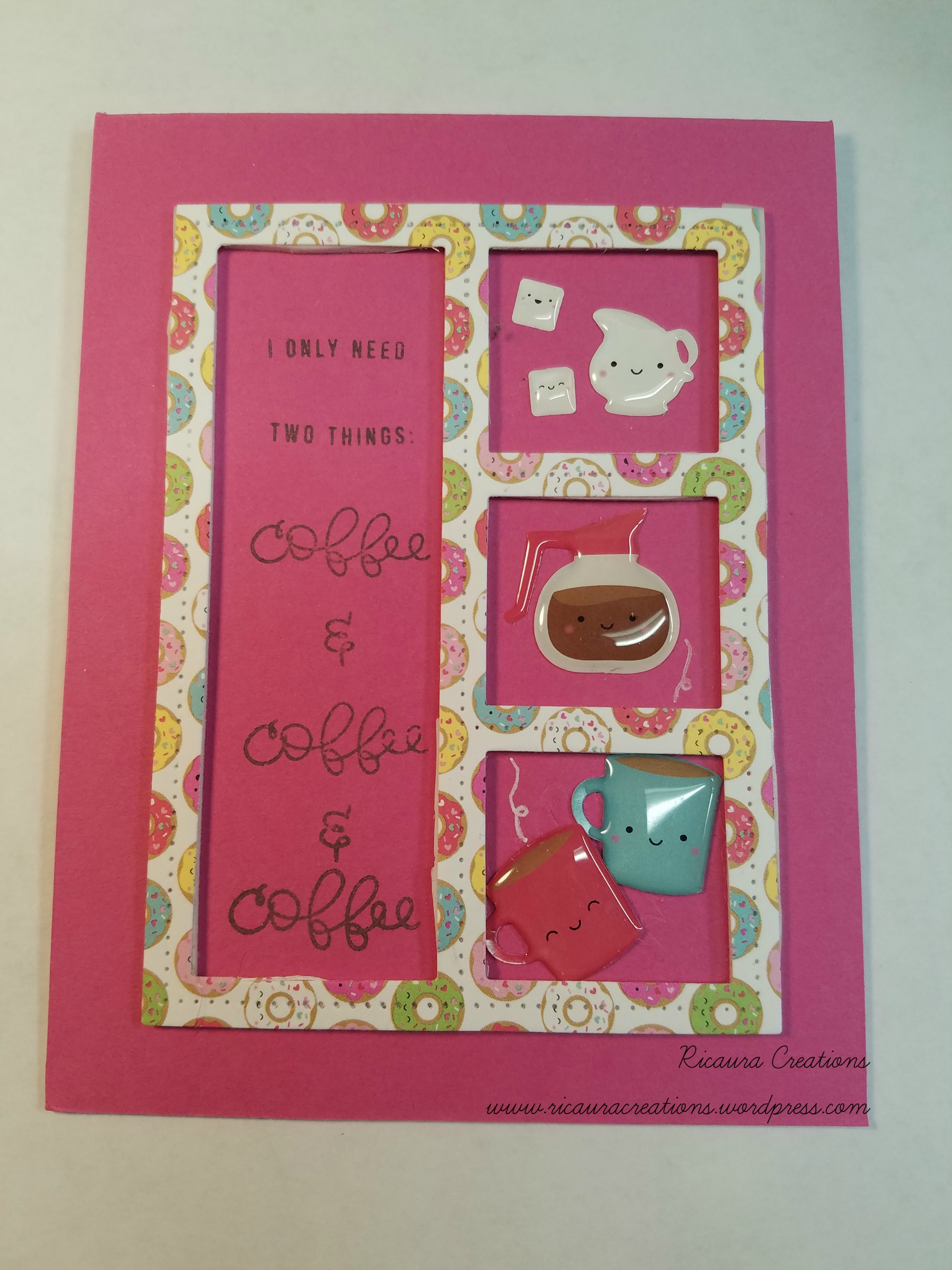
When I finished these four trios, somehow, I was left with various cut strips, squares, and rectangles that were not the pattern that I cut them out for initially. So I pieced them together to create my own Sketch design (after all, SFL’s sketch sheet is meant to inspire us!). The first card used the Whip Cream cardstock for the design panel, the brown and teal coffee cup paper, the coffee bean paper, and the teal and chocolate striped paper. I stamped the coffee cup again, used #905 Aquamarine, #944 Process Red, and #1099 Espresso to color it in. The tiny sentiment “Did someone say coffee?” was stamped, using the Chestnut Roan chalk ink, up in the right top corner. (I absolutely love these color combinations!) A few sequins and two coffee beans were added. The second card uses the Lemon Drop cardstock for the design panel, two patterned papers – dark red with “café” pattern and the golden paper with coffee beans and dots – to create the base. A strip of coffee colored ribbon from my stash was added with a bow. The sentiment and focal point were stamped on a circle using the coffee cup and the “Coffee, Coffee, Coffee” stamp in the Chestnut Roan chalk ink, slightly curved to follow the circle. I colored the coffee cup using #1099 Espresso, #944 Process Red, and #917 Sunburst Yellow. A few sequins and three coffee beans completed this card. Last, but not least, the third card uses a few leftover scraps, a die-cut oval, and a sentiment from the ephemera to create. A few sequins, two puffy sticker coffee beans, and a puffy sticker with two coffee cups completed this card. Very simple and easy, but cute. I forgot to add that most of the stamped cut pieces were “edged” with Vintage Photo Distress Oxide to keep them from being so stark white against all the bright pattern papers.

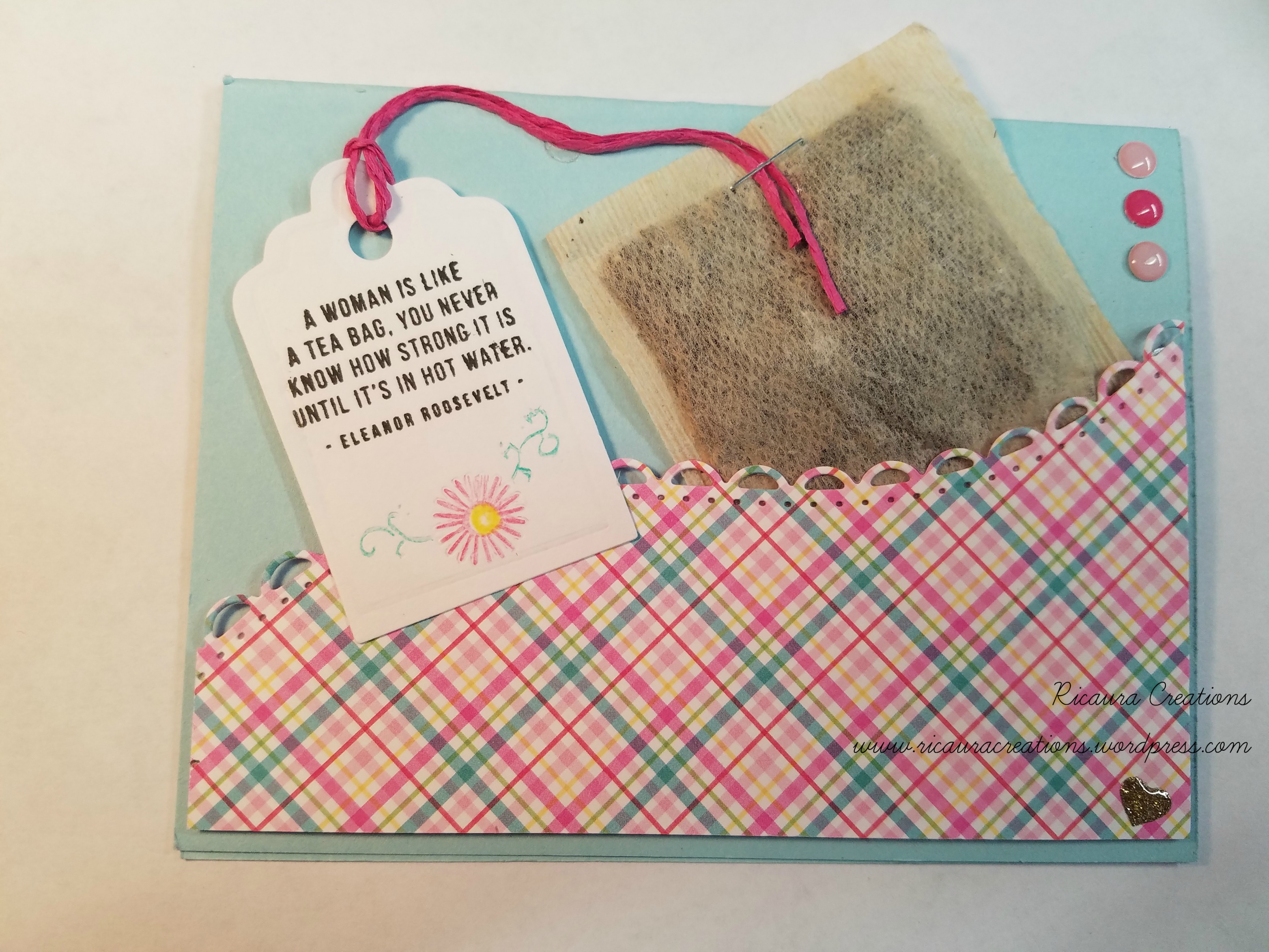
Last, but not least, I found the missing card! It’s the 4th Sketch idea and it is done on the Jelly Bean Green cardstock. This one uses the floral pattern paper, the tiny rose cross-stitch paper, and one of the cut-aparts. I layered the cut-apart off center of the white cut rectangle. It gave it a little visual adjustment, so it doesn’t melt into the background. A few sequins, a few drops of Nuvo Rosewater Crystal Drops9, and it’s done!
I hope you enjoyed seeing my creations…unfortunately, this blog post is LONG…but I got all 16 cards in! The kits from Scrapping for Less are awesome…I like the four different collections that tend to match each other, the stamps that they choose – and which add to my stash!– are also coordinated. Then they add a little bit of extras that make the kit complete. I get the Banana Split option – which comes with an extra bag of stamps, doodads, and other goodies – because it usually is an awesome selection.
Well, goodbye, good luck, and happy crafting to all. I hope your days are filled with imagination, creation, and a love of crafting! See ya next time!
Laura
***A Small Disclaimer (to make everything copacetic) – All items used in all my blogs (videos to come soon…hopefully) are (or have been) purchased with my own funds, including the Scrapping for Less Monthly Card Kit. Also, any opinion that I express in reference to any products used are my own opinion – no one told me to say it! If you decide to purchase any of the items used in my video, I will list these specific items marked with a XX mark and list it as a hyperlink below. Please enjoy crafting and you are welcome to use any of my ideas for your own cards. If you do CASE a card or purchase an item, please give credit where credit is due. Thank you all!
Supplies used are from my stash and from the SFL Monthly Kit. I do not have any affiliation with SFL, and I don’t get paid to create cards from their kits.
1. My Favorite Things cardstock https://www.mftstamps.com/supplies/mft-cardstock
2. Neenah 110# Classic Crest Smooth Solar White cardstock https://www.simonsaysstamp.com/product?id=131853¤cy=USD
3. SFL Sketch sheet (you can download it from the website) https://scrappingforless.com/2019-downloads/
4. Ultra-Heavyweight Double-Thick 110# Cover Digital Smooth White Bright cardstock
5. Scrapping for Less Monthly Card Kit https://scrappingforless.com/flavor-of-the-month/
6. VersaFine Onyx Black Ink https://www.simonsaysstamp.com/product/VersaFine-ONYX-BLACK-Ink-Pad-Pigment-Tsukineko-VF-82-23812
7. Mini Misti https://www.simonsaysstamp.com/product/MINI-MISTI-PRECISION-STAMPER-Stamping-Tool-Kit-mistimini-mistiminiM?currency=USD
8. Rosewater Crystal Drops https://www.simonsaysstamp.com/product/Tonic-ROSE-WATER-Nuvo-Jewel-Drops-647N-647NT?currency=USD